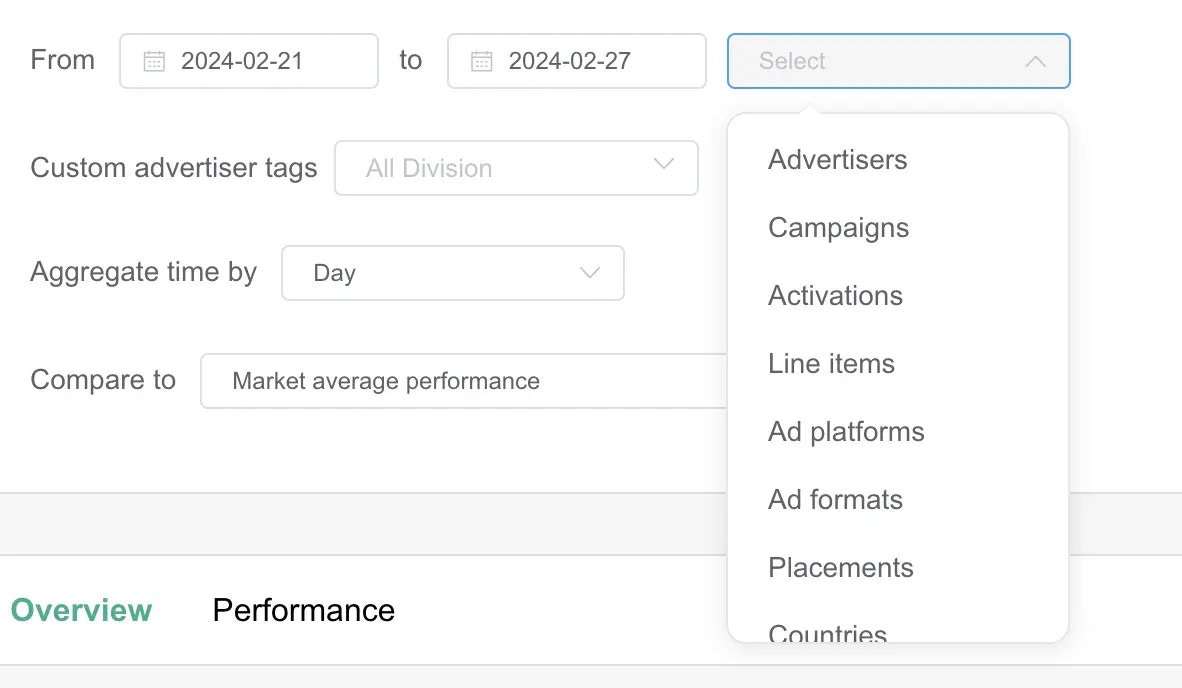

Overview Tab
This section provides a selection of dashboard views to help you understand your GHG emissions and electricity consumption.Scope Audited
This section allows users to identify the some key details on the scope which was defined above • Total invested budget (the value of investments made on the scope selected) • Total impressions (the volume of impressions made, can be filtered to show display or video only) • Number of Completed views (video only, will show the volume of videos views reaching 100% completion)GHG Emissions
This section lets you analyze the greenhouse gas (GHG) Emissions of the selected scope. This graph highlights:- Total GHG Emissions (bar chart)
- Performance (line based on the KPI selected above the graph: GHG Per 1000€ Spent, GHG Per 1000 impressions, GHG Per 1000 Views (video only))
- Market performance (based on benchmark selected)
- Carbon Intensity
Electricity Consumption
Deep dive into the electricity consumption of the scope selected. Reducing electricity consumption correlates to an improvement in Environmental Performance
- Electricity Consumption
- Performance (based on the KPI selected above the graph: Electricity Consumption Per 1000€ Spent, Electricity Consumption Per 1000 Impressions, Electricity Consumption Per 1000 Views (video only))
- Market performance (based on benchmark selected)
Performance
Check the impact of your environmental actions on your campaign media KPIs, such as eCPM and VTR.Electricity Consumption Split Analysis
Analyze Electricity Consumption of each equipment category and device type throughout the digital advertising ecosystem. Here is a table to identify actions which can be done to act on a specific category of equipment:| Data Centers | Network | End-user Devices | |
|---|---|---|---|
| Creatives | Reduce creative weight and video duration | Reduce creative weight and video duration | Reduce creative weight and video duration |
| Formats | Push more budget on formats which have the lower kWh / $1000 spent | Push more budget on formats which have the lower kWh / $1000 spent | Push more budget on formats which have the lower kWh / $1000 spent |
| Targeting | Target Wi-Fi over cellular | Target smaller screens | |
| Planning actions | Deliver more ads during days with lower carbon intensity | Deliver more ads during days with lower carbon intensity | Deliver more ads during days with lower carbon intensity |
Greenhouse Gas Emission Split Analysis
These graphs illustrate the overall Greenhouse Gas Emissions attributed to different equipment categories throughout the campaign.Performance Tab
This section lets you deep dive into your environmental performance metrics. It allows you to analyze your digital advertising activity by dimensions to identify the highest and lowest performers and context from an environmental standpoint in order to identify reduction actions. In addition to the Scope selection at the beginning, the Performance tab allows you to do deeper analysis with the following fields:- Group by structures your analysis bar chart based on the selected dimension
- Sort by determines how you want your results ordered (Impressions, Budget spent, Performance metric)
- Performance metric determines which metric you wish to use as the basis of comparison
